Communications
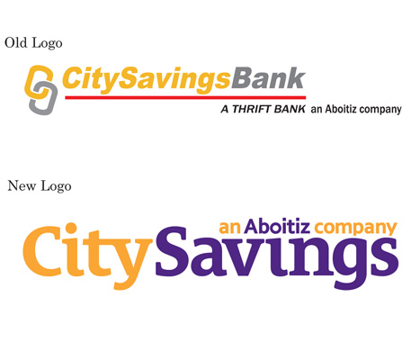
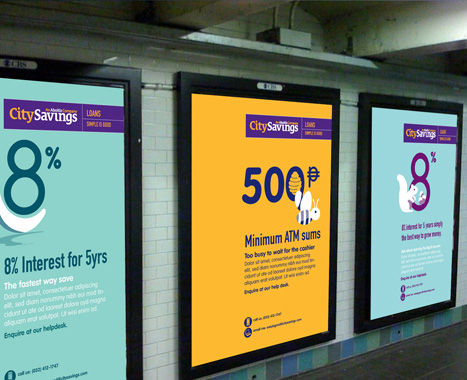
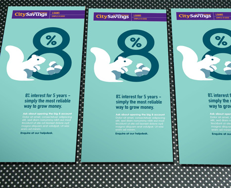
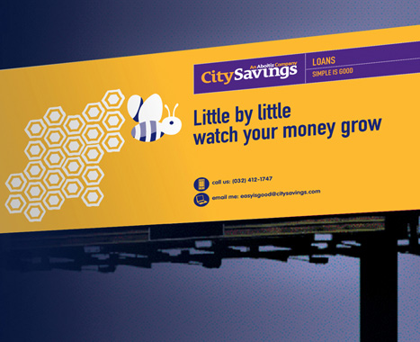
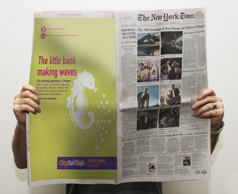
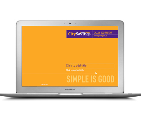
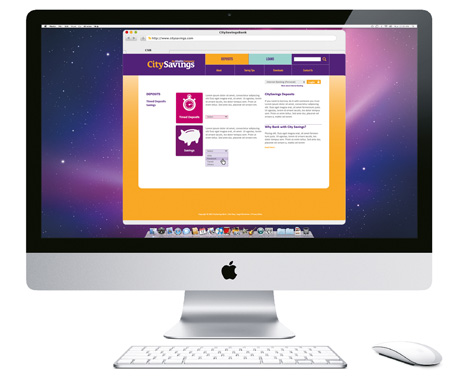
A brand promise articulating CitySavings's straightforward approach to banking was created & expressed in the tagline "Simple Is Good". The brand's new identity sports a simple word mark that integrates the Aboitiz Group endorsement. Sunflower Yellow was evolved from the existing colour palette and a Royal Violet was introduced to stand out. In place of typical lifestyle imagery, simple animal illustrations & data visualisation anchored its new look together with a straightforward copywriting style.
People
Workshops engaging management, branch managers & staff were conducted to define the brand's service principles. Examples of "on-brand" behaviour were identified and later incorporated into a brand book for all staff.
Products & Services
New product & service opportunity areas were identified in workshops. A more targeted menu system was created to highlight relevant products for different segments.
Experience
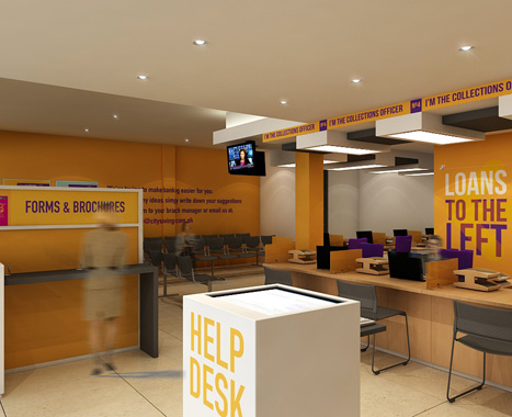
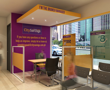
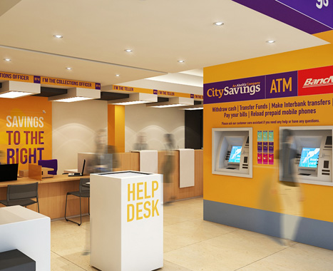
We designed a new branch concept to incorporate the brand's new look as well as signature features ideated in workshops. Together with a new website, these key touch-points were designed to create a straightforward banking experience for customers.
www.citysavings.com.ph
|