Communications
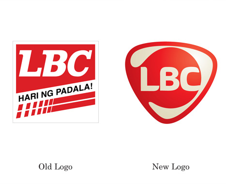
Both verbal & visual identities were completely
overhauled to reflect the new service centric brand
promise of A friend who makes your day. The
smiling global logo has 3 sides to remind staff of
their 3Cs (Brand Attributes & Services Principles)
& the logotype of LBC remained iconic & red while
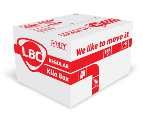
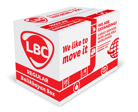
a new tagline of we like to move it reset the tone.
People
Our brand engagement workshops brought
together over 125 senior members of staff to ideate
initiatives. 9 signature initiatives were
fleshed-out before evaluated by senior
management for implementation. Tangible also
developed service standards based on the brand
attributes or 3Cs.
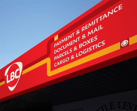
Products & Services
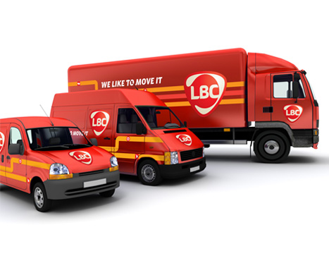
The brand architecture was reorganized to become
more customer focused. Many business units were
consolidated under the LBC name, with only LBC
Money Express and LBC Business Solutions
remaining. LBCs products were then defined by 4
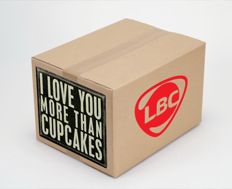
descriptive offers. All the national & international
parcels & boxes were redesigned to create clear
systems for customers & staff.
Experience
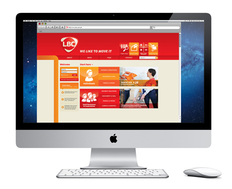
Multiple websites were consolidated into one site
that allows individuals, SMEs & corporations to
clearly navigate services relevant to their needs.
www.lbcexpress.com
|